Profile Picture

More Realistic Human Skin

Posted By hayward 4 Years Ago
You don't have permission to rate!
Author
Message
hayward
hayward
Posted 4 Years Ago
View Quick Profile
Junior Member

Junior Member (200 reputation)Junior Member (200 reputation)Junior Member (200 reputation)Junior Member (200 reputation)Junior Member (200 reputation)Junior Member (200 reputation)Junior Member (200 reputation)Junior Member (200 reputation)Junior Member (200 reputation)

Group: Forum Members
Last Active: 10 Months Ago
Posts: 15, Visits: 174
I am looking for help with my renders. I am trying to get a good realistic render for my model's skin. I am using the new realistic human skin plugin as well as the Roman Patio Prop. If you look at the render below, it seems like the model's skin is too clean and perfect. It looks too much like a cartoon. I am wondering what to do to get the skin to look more realistic. I tried to put some skin detail on it in character creator but it seems the same. I don't know if it is iray, lights, illumination, or the character itself but I was hoping for the model's skin to look a little more realistic and not look like she is made of plastic. Does anyone have any tips for the settings or tips that I can use to make sure the skin looks as realistic as possible? I also included a second pic of what it looks like in Character Creator
planetstardragon
planetstardragon
Posted 4 Years Ago
View Quick Profile
Distinguished Member

Distinguished Member (24.1K reputation)Distinguished Member (24.1K reputation)Distinguished Member (24.1K reputation)Distinguished Member (24.1K reputation)Distinguished Member (24.1K reputation)Distinguished Member (24.1K reputation)Distinguished Member (24.1K reputation)Distinguished Member (24.1K reputation)Distinguished Member (24.1K reputation)

Group: Forum Members
Last Active: 4 days ago
Posts: 11.5K, Visits: 46.0K

lighting is everything,  -  i've had skin with practically no detail look very realistic because of  proper lighting. - heck even real life pictures can look bad with the wrong lighting lol - spend a little more time getting to know the Visual panel options and familiarizing yourself with how each different light ( bulb ) affects the image -  learn to use different IBL ( image based lighting ) settings and images -   the default lighting settings are not very good so even if you used realistic skins,  it will look cartoon ish. Pay extra attention to how the shadows fall on your character and controlling the highlights.   the Realistic look is not just an obvious color,  but subtle subconscious things like the angles of the shadows falling correctly -  like when you look at an image ..and feel something is not right ...vs the obvious - subtle things like how the shadows look under the neck vs the way the background is supposed to light the scene.

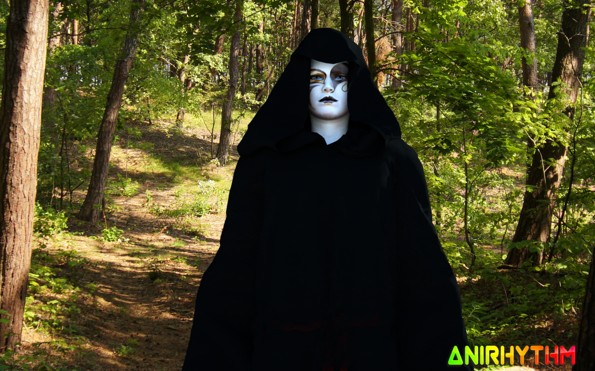
Also,  I've discovered that realistic lighting tends to have both a blue and a yellow hue -  more blue for cold weather ...more yellow for warm weather. Spend more time looking for the perfect lighting set up than the perfect skin. The proper light set up can make a plain image with no detail look realistic - I created this character from a mask photo - no realistic details at all,  yet the lighting gave it new life. also notice the subtle nuance of how the image background shadows fall in line with how the shadows on the character fall.  Every little detail that's off ...distracts from realism.
https://forum.reallusion.com/uploads/images/a7f61795-48da-47a0-b7ae-fcb2.png


☯🐉
"To define Tao is to defile it" - Lao Tzu

Edited
4 Years Ago by planetstardragon
hayward
hayward
Posted 4 Years Ago
View Quick Profile
Junior Member

Junior Member (200 reputation)Junior Member (200 reputation)Junior Member (200 reputation)Junior Member (200 reputation)Junior Member (200 reputation)Junior Member (200 reputation)Junior Member (200 reputation)Junior Member (200 reputation)Junior Member (200 reputation)

Group: Forum Members
Last Active: 10 Months Ago
Posts: 15, Visits: 174
Yeah, I am a rookie at lighting. Is there some lighting options you would look at specifically for this pic? Or do I just have to keep playing with it until it looks better?

planetstardragon
planetstardragon
Posted 4 Years Ago
View Quick Profile
Distinguished Member

Distinguished Member (24.1K reputation)Distinguished Member (24.1K reputation)Distinguished Member (24.1K reputation)Distinguished Member (24.1K reputation)Distinguished Member (24.1K reputation)Distinguished Member (24.1K reputation)Distinguished Member (24.1K reputation)Distinguished Member (24.1K reputation)Distinguished Member (24.1K reputation)

Group: Forum Members
Last Active: 4 days ago
Posts: 11.5K, Visits: 46.0K
I'd recommend starting by copying real pictures ...and just familiarizing yourself with details ...especially shadows

a lot of details are so small,  that unless you train yourself to see them,  they will be hard to notice.   So grab a bunch of your personal favorite images ...and try recreating the lighting on them so what you have to adjust becomes more obvious.


☯🐉
"To define Tao is to defile it" - Lao Tzu

planetstardragon
planetstardragon
Posted 4 Years Ago
View Quick Profile
Distinguished Member

Distinguished Member (24.1K reputation)Distinguished Member (24.1K reputation)Distinguished Member (24.1K reputation)Distinguished Member (24.1K reputation)Distinguished Member (24.1K reputation)Distinguished Member (24.1K reputation)Distinguished Member (24.1K reputation)Distinguished Member (24.1K reputation)Distinguished Member (24.1K reputation)

Group: Forum Members
Last Active: 4 days ago
Posts: 11.5K, Visits: 46.0K
here's a photograph that's close to your render in color ...compare the shadows and the amount of brightness on this image to yours  - even small details like the shine in the eyes and how the background shadows are in sync with the face shadows.  and if you focus on it hard enough,  you can even see a subtle yellow and blue hue in the lights,  suggesting the temperature of the room -  these are the details you need to train yourself to see.

https://forum.reallusion.com/uploads/images/5168559f-9f1b-4e3d-8abc-7e61.jpg


☯🐉
"To define Tao is to defile it" - Lao Tzu

Edited
4 Years Ago by planetstardragon
hayward
hayward
Posted 4 Years Ago
View Quick Profile
Junior Member

Junior Member (200 reputation)Junior Member (200 reputation)Junior Member (200 reputation)Junior Member (200 reputation)Junior Member (200 reputation)Junior Member (200 reputation)Junior Member (200 reputation)Junior Member (200 reputation)Junior Member (200 reputation)

Group: Forum Members
Last Active: 10 Months Ago
Posts: 15, Visits: 174
Wow, I really like that! Now, mine is an animation so I hope it will not be too hard. Thanks for your help!
animagic
animagic
Posted 4 Years Ago
View Quick Profile
Distinguished Member

Distinguished Member (33.4K reputation)Distinguished Member (33.4K reputation)Distinguished Member (33.4K reputation)Distinguished Member (33.4K reputation)Distinguished Member (33.4K reputation)Distinguished Member (33.4K reputation)Distinguished Member (33.4K reputation)Distinguished Member (33.4K reputation)Distinguished Member (33.4K reputation)

Group: Forum Members
Last Active: 6 hours ago
Posts: 15.8K, Visits: 31.3K
Also check the setting of Real-time Texture size in Preference. If it is a low value, you won't see the details.


https://forum.reallusion.com/uploads/images/436b0ffd-1242-44d6-a876-d631.jpg


Reading This Topic