|
By GOETZIWOOD STUDIOS - 6 Years Ago
|
Hi,
Nowadays, movies Directors of Photography use more and more what is called "False Colors" in order to control and set the camera exposure. They barely use light meters anymore for this, only for checking contrast on their subjects from different light sources.
With digital cameras you can directly see in realtime what the sensor is capturing so it is easy to make some adjustments directly by looking at that result, False Colors being a way to be more precise than doing it just by "eye". This is also a way to decouple exposure "values" from specifics from the camera (ISO or rather Gain, Aperture, Shutter, ND filters, ..) to a normalized 0% to 100% range (you will see sometime the term IRE but this is nothing more than percentage really). If you light an object to be in the 20% to 30% range, it will look the same, ultimately, whatever combinaison of Gain, Aperture, Shutter you set on different camera (in terms of exposure that is).
Using False Color is nothing more than applying a colored gradient to the luminosity of your image. So you can have red near black areas and yellow or white near the brightest areas. Here is one I made in Photoshop:
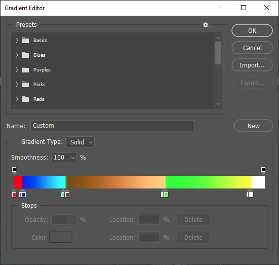
Colors from left to right will be applied on your image areas from full dark to full bright.This gradient one is a bit more complicated than a simple gradient.
Notice there is a middle range that has a kind of brownish gradient of color. This is what we call the Skintone range and it is supposed to show where should be exposed your subject (face) to be correctly exposed while maintaining sufficient space for informations above (lighter) and below (darker). This is obviously relatively subjective and each DP has his preferences (depending on the quality of the camera sensor, its "color science" and obviously its dynamic range). I chosen mine to be between 20% and 60% which is a bit wide (you will usually see 50% to 70% in movies) but this is due to the very limited dynamic range of what we get from the iClone renderer without proper Tone Mapping.
Notice there are also extreme areas, on the left (red) and right (white), kind of a safeguard zones. You don't want to have 0 information in some areas of your image nor clipped informations (except on purpose like lights and some reflection highlights).
So what do I do with that gradient ? I've created a special effect LUT for iClone so I can apply this gradient directly to the final image. Download the attached FalseColors_20-60.rar file that contains a FalseColors_20-60.iEffect file and put it in your effect template.
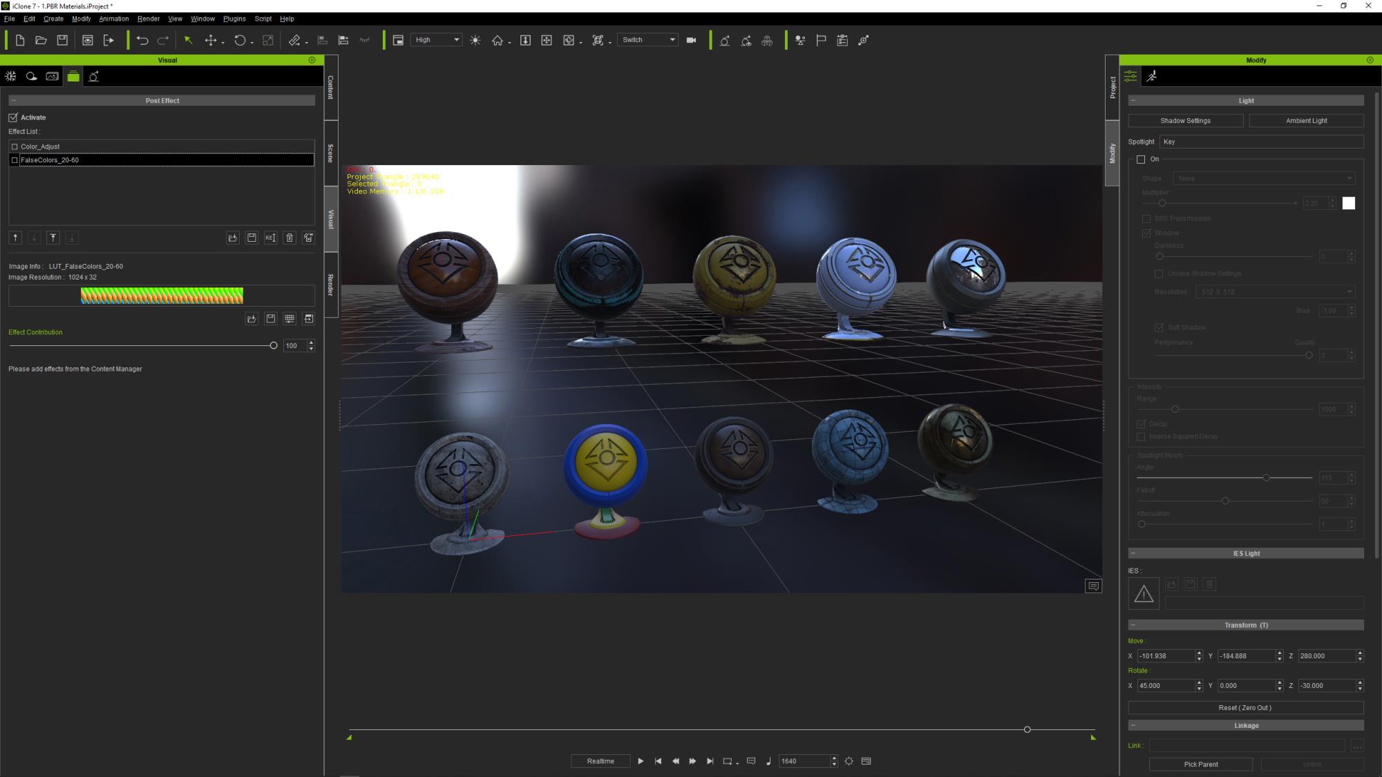
Now lets try it in iClone. Load the sample PRB Materials project and go to the frame 1640:
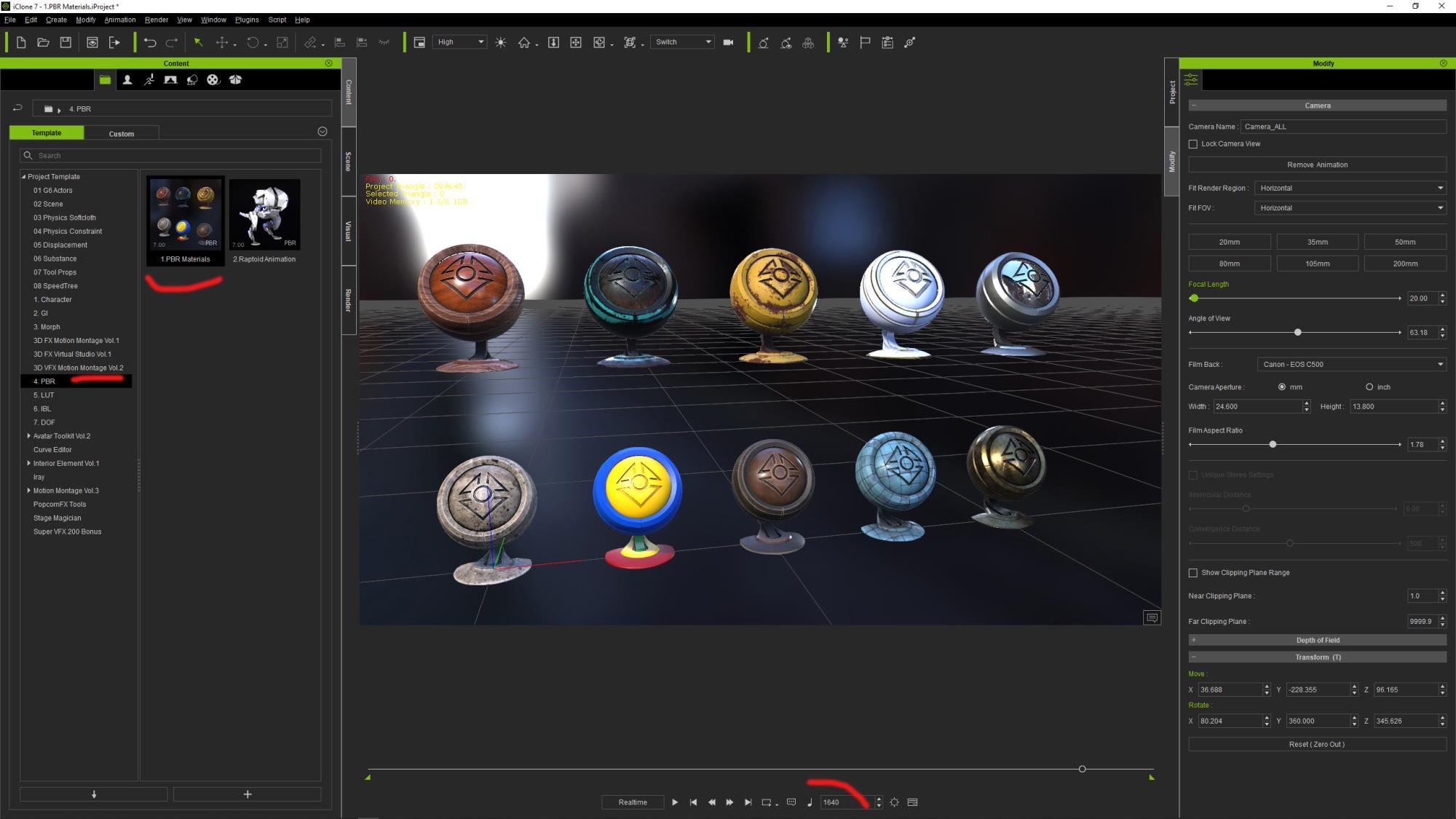
Go to the Visual -> Effect Tab and remove the 2 default ColorAdjust effects. Then load the iEffect you got from here. Activate only the "FalseColors_20-60 effect, you should now see something like that:
We can clearly see there are white and yellow on some critical areas on the dummy material objects that shows those are overexposed.
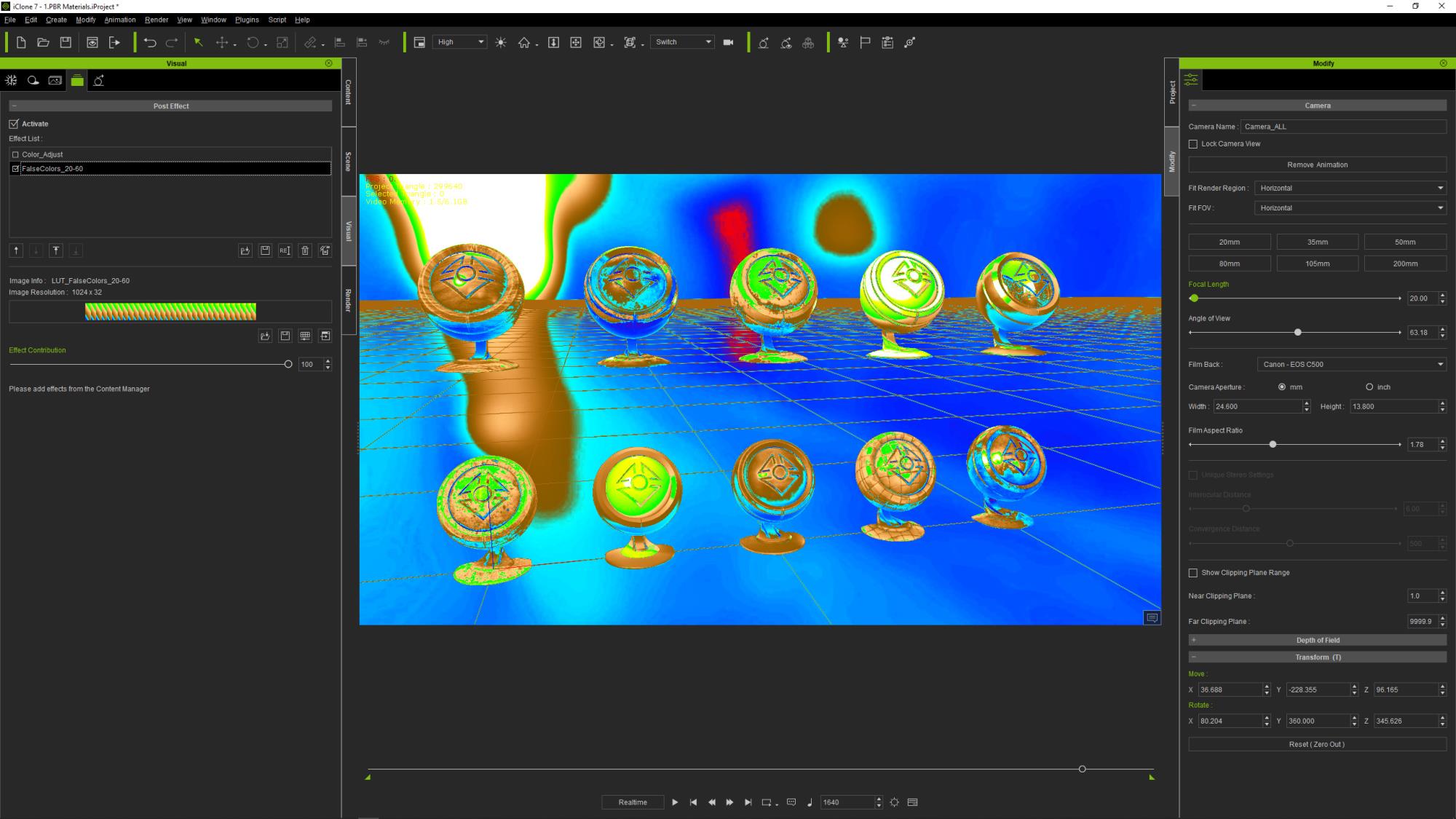
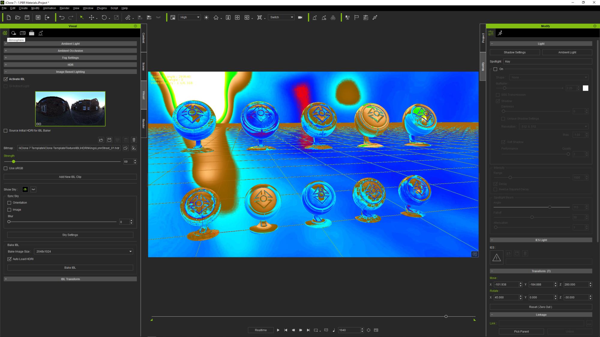
We will try to start from scratch, disable the IBL light and the 3 scene lights, then I like to start with the "ambient" lighting by playing with the IBL strength so that there are information in the dark areas, try to remove reds but not too much strength, just so we start to see the skintone in some places:
And if you deactivate the False Colors you should have something like that:
And this is exactly what we want, an ambient lit scene without 0/red area. Now we can play with the scene Key light, Rim and Fill lights until we get something we like while being careful to not introduce too much yellow and avoid white area except where it makes sense (direct light and reflection highlights):

And the resulting exposed image:
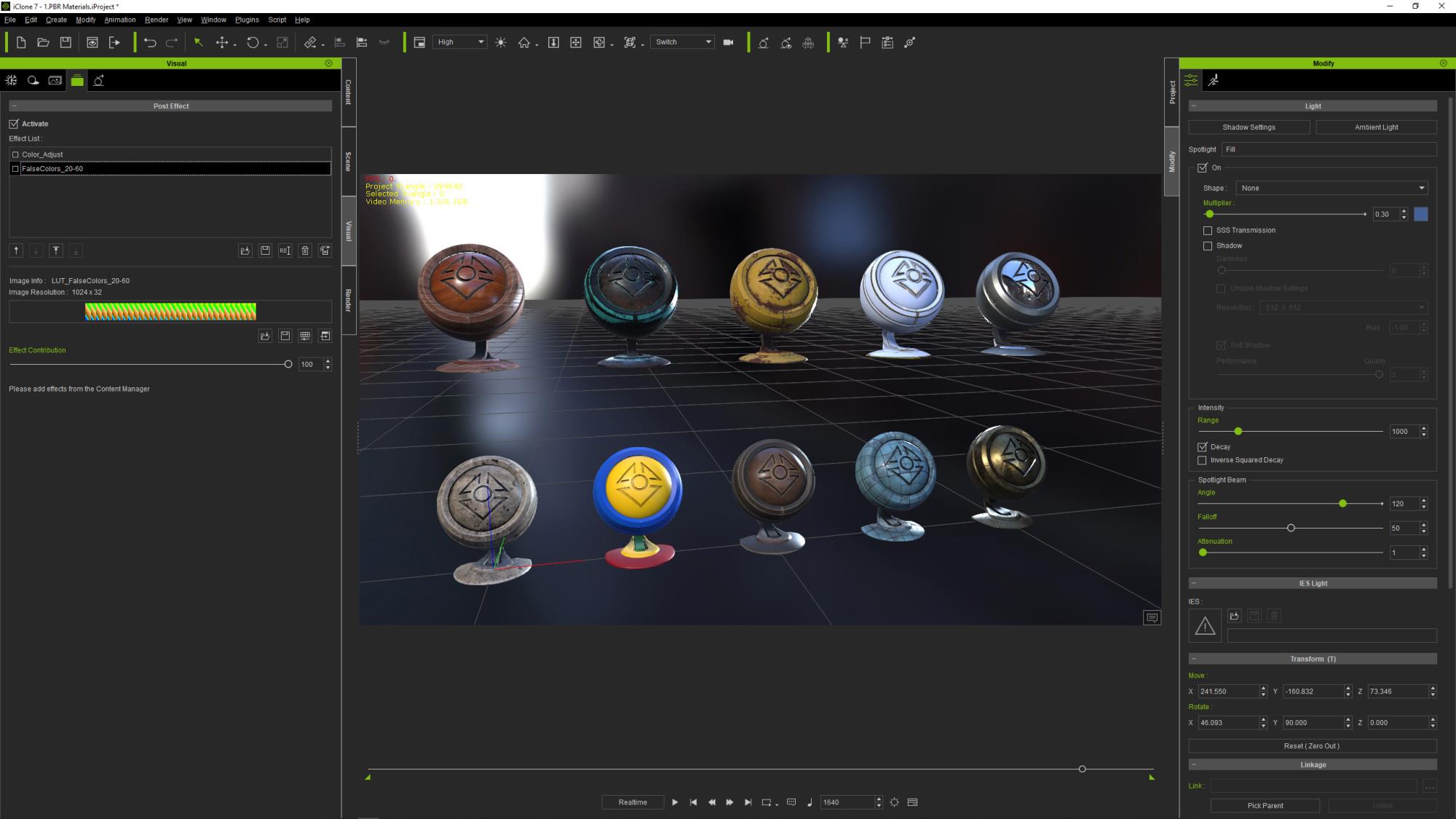
Now if you carefully compare this result with the first image after we opened the scene you will notice that we have been able to retrieve valid color information from the white dummy "iClone7_MaterialBall_04" that had large clipped areas in its high lit areas. Accordingly, we have retrieved valid color information from the yellow "iClone7_MaterialBall_07" that had large "burnt" areas in its high lit areas.
By using this False Color method to control the exposure of the rendering of our images we clearly see that we can precisely adjust any kind of combinaison and quantity of light sources (HDRI IBL Lights GI etc..) so the image will be perfectly exposed. No area with black value, no burnt nor clipped areas unless on purpose.
We really are "in control" and as such we can have consistent exposure from one shot to another one, from scene to scene.
Of course you are not obliged to use this particular LUT/Gradient, you can create your own that may better suit your style, as long as it protects you from absolute dark areas as well as burnt and clipped ones.
|
|
By wildstar - 6 Years Ago
|
thx for that, i will give it a look , and talk about later
|
|
By wildstar - 6 Years Ago
|
thx for that, i will give it a look , and talk about later
|
|
By Warped Reality VFX - 6 Years Ago
|
Hello, GOETZIWOOD STUDIOS thank you for taking the time to make this tutorial.
And sharing your knowledge in this area, much appreciated.
Best Regards.
Kevin L.
|
|
By GOETZIWOOD STUDIOS - 6 Years Ago
|
@Kevin L
Thanks for letting me know Kevin, You're welcome.
|
|
By animagic - 6 Years Ago
|
|
Thank you for this , Guy. I have been attempting to improve the cinematographic look of my latest movie, so this is very timely and helpful. So much to learn...:unsure:
|
|
By GOETZIWOOD STUDIOS - 6 Years Ago
|
@animagic
You're very welcome Job, I'm glad this is helpful!
|
|
By GOETZIWOOD STUDIOS - 6 Years Ago
|
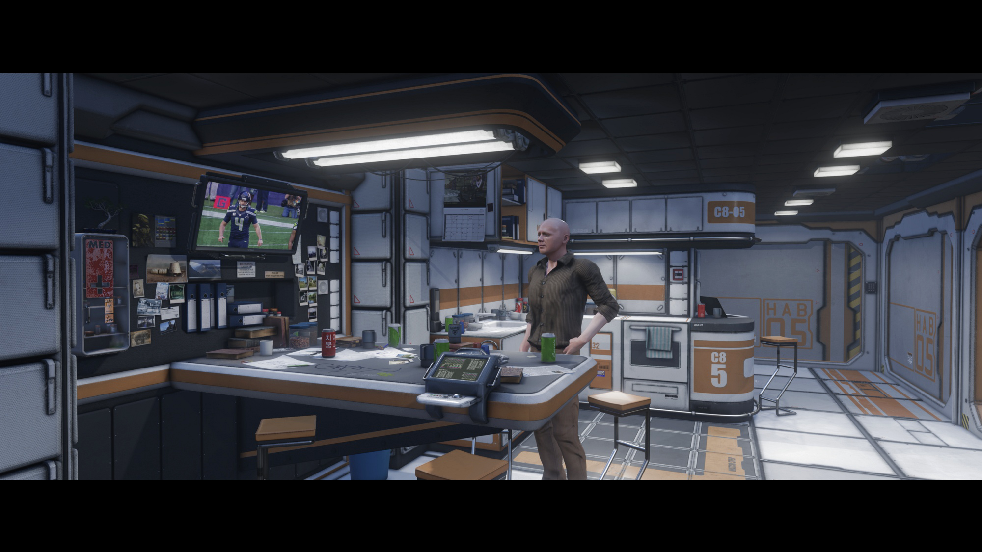
I often talk about this "PBRish"/"Plausible Realistic" look I'm seeking, but I have to admit I don't post much results.
So for the sake of illustration, here is one:
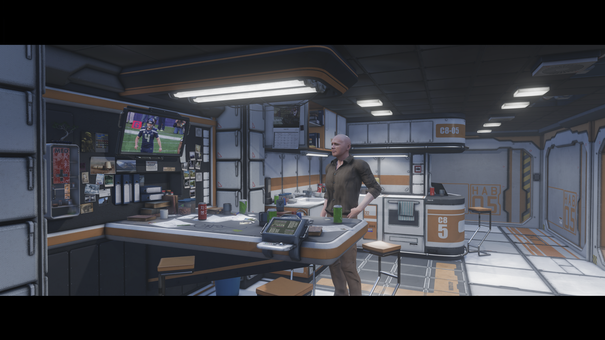
I have used False Colors of course, to control the exposure, I'm also using the Highlight Desaturation LUT. Here is what the False Colors show:
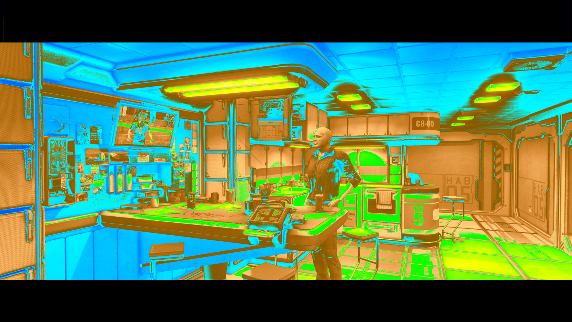
As you can see I'm respecting the rules, there is no or barely white (clipped) area, there is no red (no information) area neither. The "ambient" lighting is high enough (but not too high) so there is a lot of details visible in the darker areas (light blue) and strong shadows are where they are needed (dark blue) thanks to the help given by Ambient Occlusion.
I like to think it works well in this "PBRish"/"Plausible Realistic" spirit. It is by no mean photorealistic, but neither "gamish"/"stylized", at least to me. And I like to believe that some peoples may think at first this is rendered with some kind of pathtracer like iRay. The impression won't last long through scrutiny of course but what's important is to "sell" the look quickly. Don't forget we are in the context of doing movies here, not still images. So what's really count is the action and characters performance. And if the look is plausible enough to not disturb the audience then that would be a win to me. At least that's my strategy.
By the way, the character shown here is an old one, not a CC3.2 + DHS one, so he only has "PBR" materials and can and will be improved a lot.
Also, the image is not artistically "Color Graded", it is just correctly exposed, right from the camera.
Anyway, I really would like to have your feedback about this "PBRish"/"Plausible Realistic" spirit and approach, do not hesitate to comment.
Perhaps you think it is not realistic enough, that's fine with me and we can discuss it. Or perhaps not stylized enough.
Or it is something in between that would work ok or on the contrary perhaps disturb the audience ?
In any case, feel free to share your thoughts and arguments, I don't bite ;)
|
|
By mtakerkart - 6 Years Ago
|
Very cool Guy . May you can make a 15 sec video render with some camera dolly and a new cc3 character whit idle motion ?
|
|
By sonic7 - 6 Years Ago
|
Hi Guy .... Your approach certainly retains detail from highlights right through to the low-light areas - and has a distinctive look. I think it's a personal taste thing. Expanding your range (0-255) to occupy 14-250, (as a reference - of what I'm more 'used to') and comparing before and after, I'd say yours somehow has a more 'cinematic' feel, whereas the 14-250 although 'punchier' is now somewhat more 'video-like'.
|
|
By GOETZIWOOD STUDIOS - 6 Years Ago
|
@mtakerkart
Sure.
@sonic7
I'm not sure to follow you. I mean, what is your point exactly ? :) The fact I like going toward photorealistic rendering is clearly a question of taste, yes, but from there, the need to retain details from highlights right through the low-light areas is not. It is a question of "technical quality". This very same constraint applies to cartoonish rendering or any stylized rendering. Whether you are "shooting" in 3D or on film, on DSLR/M or on digital camera, this will always be the case and if you don't address this constraint properly, your future as a DP is very compromised ^^.
Regarding the range, in the false colors gradient I use there is no "safe video" 14/250 range per say. Values can go near 255 as well as 1, 2, 3, .. What you did is a simple Color Grading that makes the image "punchier", but to my eyes it does not make it more "video-like". This Color Grading could be even more drastic yet retains it cinematic feeling. Repeat the exact same process on any movie screenshot, I doubt you will find the result more "video-like", "punchier" for sure :)
|
|
By GOETZIWOOD STUDIOS - 6 Years Ago
|
|
mtakerkart (12/6/2019)
../.. May you can make a 15 sec video render with some camera dolly and a new cc3 character whit idle motion ?
Here it is, video rendering straight out from iClone, no extra AA, no Motion Blur, 720p:
|
|
By sonic7 - 6 Years Ago
|
Hi Guy .... My point was simply to compare two ranges to see how your shot looks when covering more of the 0-255 range. (ie: less flat). Obviously the amount would vary from shot to shot - in this case 14-250 still avoided clipping. I was simply comparing it (the before) with what I'm 'used to' ie: higher contrast. To me, a more contrasty shot gives the *impression* of sharpness - which (to my eye) is more 'video' than 'film' like. That's one thing I do like about film (at least my impression of it) - it can look really good without being razor sharp. And that's why the look of your image (to my eye) looks closer to 'film' - (because it's slightly flatter). So it was an exercise in comparing the two ranges. ~ Steve ~
|
|
By GOETZIWOOD STUDIOS - 6 Years Ago
|
|
mtakerkart (12/6/2019)
../.. May you can make a 15 sec video render with some camera dolly and a new cc3 character whit idle motion ?
I took the time to render a much better quality version. This one is 1080p, is from iClone Image Sequence rendering -> Premiere -> Full Motion Blur (RSMB) -> DNxHR SQ 2K 24fps (MXF).
|
|
By sonic7 - 6 Years Ago
|
The motion blur's effect is certainly noticeable on the wall monitor footage (the text is tamed too). How would you compare the 720p vs 1080p (resolution wise)? I'm thinking there's not much in it due to the extra processing.
|
|
By GOETZIWOOD STUDIOS - 6 Years Ago
|
|
sonic7 (12/7/2019)
The motion blur's effect is certainly noticeable on the wall monitor footage (the text is tamed). How would you compare the 720p vs 1080p (resolution wise)? I'm thinking there's not much in it due to the extra processing.
The motion blur is quite strong indeed, twice as standard. For a real movie I probably wouldn't go that far, nonetheless I still can see a much better image and details on the 1080p on my side though.
|
|
By GOETZIWOOD STUDIOS - 6 Years Ago
|
|
sonic7 (12/7/2019)
Hi Guy .... My point was simply to compare two ranges to see how your shot looks when covering more of the 0-255 range. (ie: less flat). Obviously the amount would vary from shot to shot - in this case 14-250 still avoided clipping. I was simply comparing it (the before) with what I'm 'used to' ie: higher contrast. To me, a more contrasty shot gives the *impression* of sharpness - which (to my eye) is more 'video' than 'film' like. That's one thing I do like about film (at least my impression of it) - it can look really good without being razor sharp. And that's why the look of your image (to my eye) looks closer to 'film' - (because it's slightly flatter). So it was an exercise in comparing the two ranges. ~ Steve ~
My point is that what's rendered from a camera, from iClone here, is never the final image. The goal is to have a technically correct image even if in it there is already an artistic work from the lighting. The goal is to have a maximum of "informations" in the image so Color Grading can be done efficiently, even if some informations are "buried" later on in the final, color graded, image.
For instance, here I color graded the previous video and I would probably use the result in a final movie, despite the exaggerated motion blur.
The colors are warmer and there is more contrast (it is more "punchy" like you say), despite the fact that now the signal goes from full 0 to 255.
|
|
By sonic7 - 6 Years Ago
|
Yeah, you'd be looking on a better monitor than me, plus yours is the 'original'. But once the tracking shot came to rest (ie: the motion-blur wasn't doing it's thing), I could see more detail in the 1080. My display is only 1080p ..... (we cross posted - lol) ...
|
|
By sonic7 - 6 Years Ago
|
Yeah - that last one looks good to me! - Interestingly, fyi, the 3 examples you've uploaded, I downloaded, and were as follows:
● vers 1 - 2,595 KB (30 fps)
● vers 2 - 3,660 KB (24fps)
● vers 3 - 4,291 KB (24fps)
Yeah - I do like your style Guy .....
|
|
By GOETZIWOOD STUDIOS - 6 Years Ago
|
|
sonic7 (12/7/2019)
Yeah - that last one looks good to me! - Interestingly, fyi, the 3 examples you've uploaded, I downloaded, and were as follows:
● vers 1 - 2,595 KB (30 fps)
● vers 2 - 3,660 KB (24fps)
● vers 3 - 4,291 KB (24fps)
Yeah - I do like your style Guy .....
Yes the first one was rendered as a video directly from iClone and I forgot to set the fps ^^
Regarding the size, mine are both 202 082 KB for both v2 and v3 in mxf format so you can imagine the loss of quality through youtube : /
(and the excessive motion blur is actually less disturbing on the original video)
|
|
By sonic7 - 6 Years Ago
|
Lol - yes 1/50 the size !!!
But even so, that last one does look quite nice ....
|
|
By GOETZIWOOD STUDIOS - 6 Years Ago
|
|
sonic7 (12/7/2019)
Lol - yes 1/50 the size !!!
But even so, that last one does look quite nice ....
I should probably use Vimeo for things like that :)
Thanks!
|
|
By GOETZIWOOD STUDIOS - 6 Years Ago
|
I sent the last video to Vimeo and the quality is definitely better.
It is not that obvious at first but the textures are definitely more detailed especially when the camera does not move.
|
|
By sonic7 - 6 Years Ago
|
Yes Guy, the Vimeo version definately looks better - the file size of the 1080p download was 5,703 KB - so there's more detail retained.
|
|
By GOETZIWOOD STUDIOS - 6 Years Ago
|
To properly conclude this topic, I wanted to do a "proper" version of my illustration shot by using all the latest v7.7 features, so I've redone the lighting from scratch.
Mainly I used shaped lights and the "Inverse Squared Decay" option (physically correct, natural decay) on all lights.
I've also used all the anti-flicker switches (Shadow, GI) and avoided HDRI aliasing by using a LDR image instead of a HDR image as IBL light (that I only use for "ambient lighting").
Last but not least, previously the scene was only lit from "practical lights". So I've added a final touch that any DP would probably have done, I added a blueish RIM light on the right of the Character.
And I've rendered the all sequence as images sequence in 4K (for 2K production) to have extra antialiasing on top of the iClone 3x3 supersampling.
Here is the result:
I'm very happy with the result, it is quite different from the previous one but imho much more natural while having similar "softness". (I bet some of you will prefer the previous one, probably because it is a bit warmer but I could fix that with color grading, the important thing here is the lighting "behavior").
This comforts me with the idea that I can approach what a pathtracer could give me with a fraction of the rendering time with the native iClone rendering. It is not perfect and still misses features, but we can definitely produce decent images with it.
The thing is, in this scene, the set is from an old Stonemason (from DAZ3D) set which has barely PBR materials. I had to cheat here and there to make some material more PBRish but this is definitely not a true PBR set.
And that's why the result is not as photorealistic as it could be.
And this is interesting because it shows one thing (which is my all point with this "PBRish/Plausible Realistic" kind of rendering idea):
While both contribute in each aspect:
1) Lighting and Exposure define the "cinematic look".
2) The PBR materials define the "photorealistic look".
To better illustrate this, check these two images, one being a screenshot from the movie "Aliens" (1986).
I've color graded mine to match the color grading of this Aliens scene:

The "Aliens" screenshot is definitely more photorealistic, for obvious reasons, but in terms of cinematic look, we feel definitely "at home" with my image.
Same "softness", "punchyness", "highlightness", you name it, even the skintone, albeit mine should be a little bit warmer, a bit more reddish but this can be easily addressed.
If you don't pay much attention at first you could definitely think both images are part of the same movie.
|
|
By nealtucker - 6 Years Ago
|
Hi and thanks for sharing this information, I've been playing around with your False Color LUT and it certainly seems to improve things or at least make it clearer as to what is under and overexposed and help keep detail in the shadow and highlight areas.
Like you mentioned in another video you can add a desaturation LUT before the False LUT to tame things a bit,
I tried your False LUT to get a scene exposed correctly using this and then experimented with different Film LUTs to get a different feel to the Video/scene animation which seems to work well.
So thanks a lot.
N.
|
|
By GOETZIWOOD STUDIOS - 6 Years Ago
|
@nealtucker
You're welcome. I'm glad you find it useful.
|
|
By GOETZIWOOD STUDIOS - 6 Years Ago
|
The same method in lighting and exposure can be applied with very different lighting conditions.
In, the previous example, there were a lot of practical lights, one key light but no sun.
Here is another example with only one sun and one practical light:


The method still works pretty well, at least to me.
The "magic feature" I use and I like a lot is to play with the IBL lighting (with a Low Dynamic Range Images, not HDRI) to control the overall ambiance of the scene, especially in the low key areas.
Here are the same renderings but with IBL deactivated:


Very different, right ?
It feels less "sunny", despite the sun being quite strong. I could boost the sun light or GI power, but by doing so I would quickly burn the highlights, and I would not get that blueish color in the low key and shadows we are use to with sunny days.
By "cheating" and using the IBL light, I can control exactly the amount of ambiance I want in the low key and shadow areas without burning the highlights (at least not as quickly as by boosting the main sun light or the GI power). Yet it works perfectly with Ambient Occlusion.
This is actually an old VFX industry trick from the early 2000 when Ambient Occlusion was just invented by ILM, and before pathtracers could be even used in production (to slow). It has been used on numerous blockbusters (Pearl Harbor, Jurassic Park, ..).
They also used HDRI images but for reflections, in combinaison with "Reflection Occlusion" which is a variant of the Ambient Occlusion. Unfortunately, iClone does not allow the use of several IBL "lights" (for different channels like diffuse/reflection) nor has the "Reflection Occlusion" feature.
|
|
By nealtucker - 6 Years Ago
|
Again great info, I would love you to do a video walkthrough of how you use the false-color LUT and the decisions you make along the way?
Cheers
Neal
|
|
By GOETZIWOOD STUDIOS - 6 Years Ago
|
|
nealtucker (12/12/2019)
Again great info, I would love you to do a video walkthrough of how you use the false-color LUT and the decisions you make along the way?
Cheers
Neal
I would love to too but.. my spoken english is awful and I believe that would be a terrible experience for the audience ^^
Perhaps I'll try that in french at some point but then I'd have to take the time to add sub-titles.
For little hints, tips and tricks its too time consuming for me but may be the day I'll have something completed (a short movie or something) then I could probably take the time to create some kind of making of / course with a series of videos.
|