Hi,
If you've red my post about "
Exposure With False Colors" and tried to apply it, you may feel uncomfortable at first because you'll probably feel your final images are probably "darker" than usual.
This is normal and usually because of 4 factors:
1) Your monitor Luminance usually too high.
2)
Your Working Room Ambient Lighting usually too high.
3) Your scene ambient lighting usually too low.
4) An image from an renderer is not the final image and needs color grading
Just a note here, I'm still targeting iCloners who tend to seek for "cinematic" imagery, close to actual movies. For those seeking for cartoonish or stylized rendering, I won't be very helpful here.
First, let's take a look at an actual movie image, here is a screenshot from the "
The Seven Ups (1973)" movie with Roy Scheider:
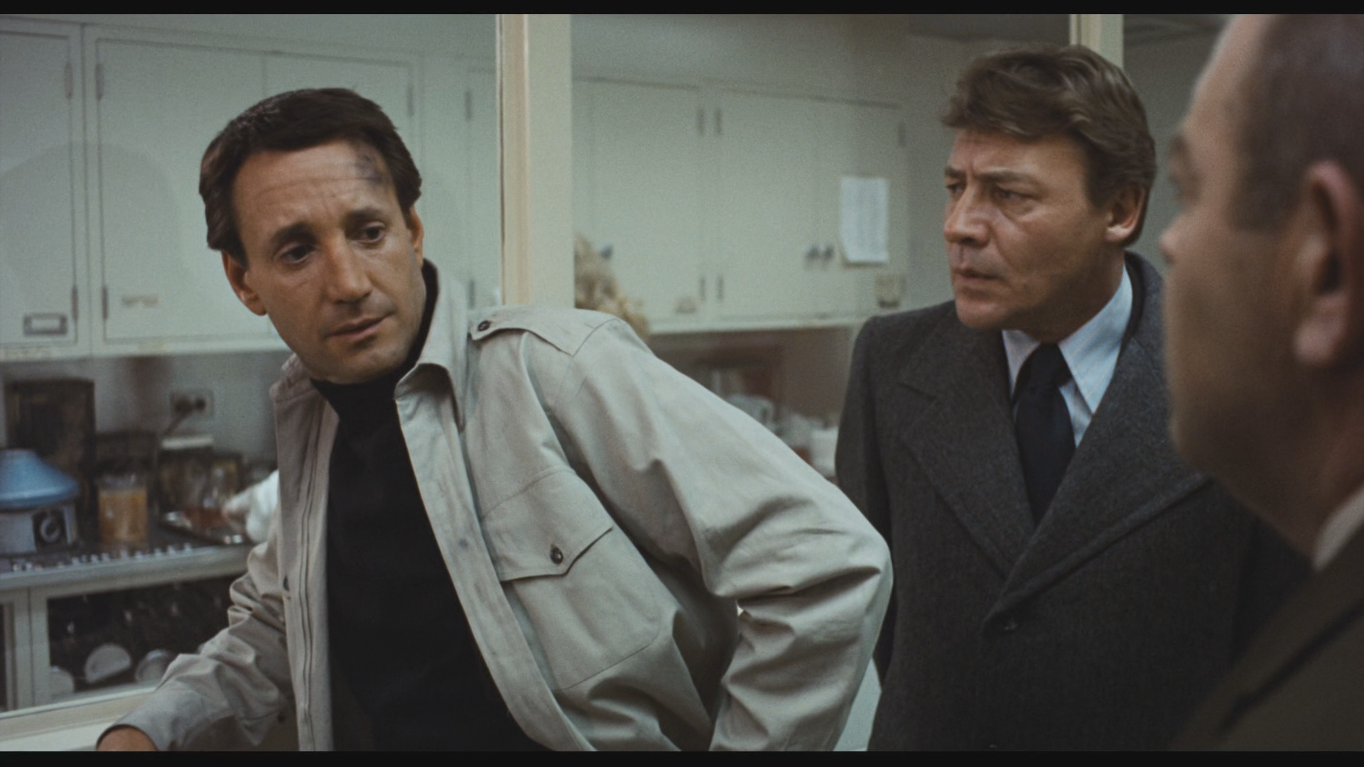
At first, you will probably think this image is much brighter than your usual render but in fact it is not. It has probably less contrast though. Lets check what the FalseColor LUT tells us:
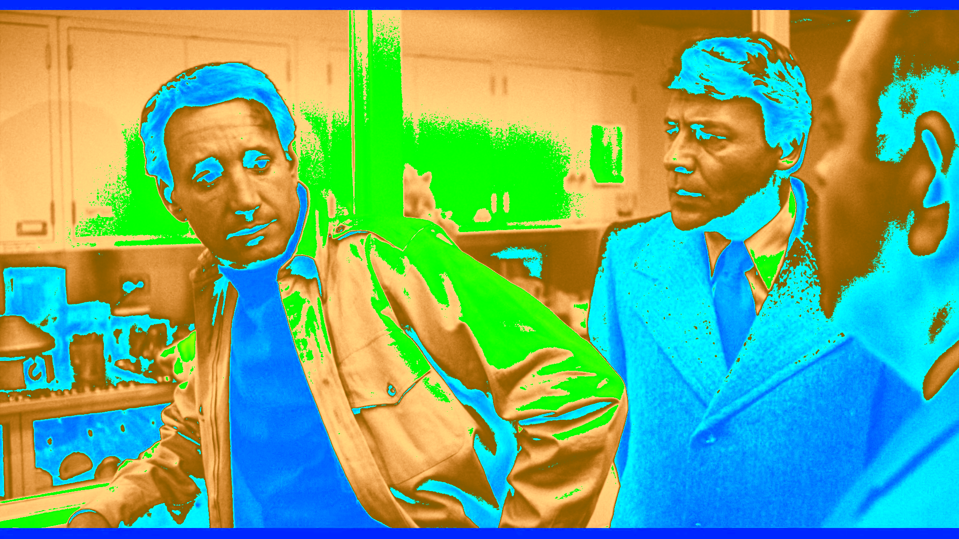
Interestingly, there is no red area (even the letterbox "black" bands are not "black"

, even more interestingly not only there is no white area but barely yellow areas. This has been shot on film, and film has the natural tendency to heavily compress highlights, this is one of the reason.
Another thing to note is that the ambient lighting is relatively high, the light blue areas, which is something you should be careful in your iClone rendering, you must have enough lighting in your dark areas but never use the "Ambient" parameter, just use LDR (non HDR) IBL lighting combined, if needed, with GI (don't push your GI strength too high though) and of course other regular lights with low intensity. Also we see that the actor faces are right on the Skintone exposure area.
Beside point 3) which concerns directly your scene lighting, there are 2 important factors regarding your working environment setup:
1) Your Monitor Luminance
If you have a relatively decent and recent monitor, instead of a "Brightness" parameter you may have a "cd/m²" parameter, or candela per squared meter which is a luminance unit. I bet most of you are currently set at at least 300 if not 1000 or even higher.
This affects the way you perceive the brightness and contrast of your images. The industry standard for color grading is around 100
cd/m² for TV and even less 80-90
cd/m² for movies.
If you have this cd/m² parameter on your monitor try to set it at 100 cd/m².
I bet now you will say: wow, I almost don't see anything anymore

This is normal, first you need a moment to get use to it, and second you also have to adjust...
2) Your Working Room Ambient Lighting
Industry standard here is around 5 cd/m² !! I let you evaluate what that means by comparing the light emitted by your monitor set at 100 cd/m². In short: almost darkness here, low intensity indirect lights.
Once in the right condition, you should then be much more confortable at adjusting your rendering with the help of false colors.
4) Last but not least, as for movies, the images you get from your renderer are *NEVER* the final images the audience sees. You always apply some sort of (technical) color grading, even just if it is to balance the look of the images from one shot to another. At this stage you can brighten even more your images if you feel they are still too dark but usually, with the right tools (false color), the right work (good lighting) and the right conditions (working environment) your images should be quite ok, at least technically. The last step would be the "artistic" color grading work where you strongly modify the mood of your shots by messing with the colors, the gamma, the shadow, mid and highlight areas of your images if not even masking some elements and do some process on those (ie, brightening only the eyes of an actor, changing the sky color, etc..).
--
guy rabiller | GOETZIWOOD STUDIOS
"N.O.E." (Nations Of Earth) Sci-Fi TV Show, Showrunner.
Edited
5 Years Ago by
GOETZIWOOD STUDIOS